Codex OS
Codex is an app for building and exploring personal knowledge graphs using digital artifacts, like text, images, and video. What its inventor, Iian Neil, calls a knowledge worker's operating system. Here's how we went about discovering a brand and visual identity for Codex.

Mood
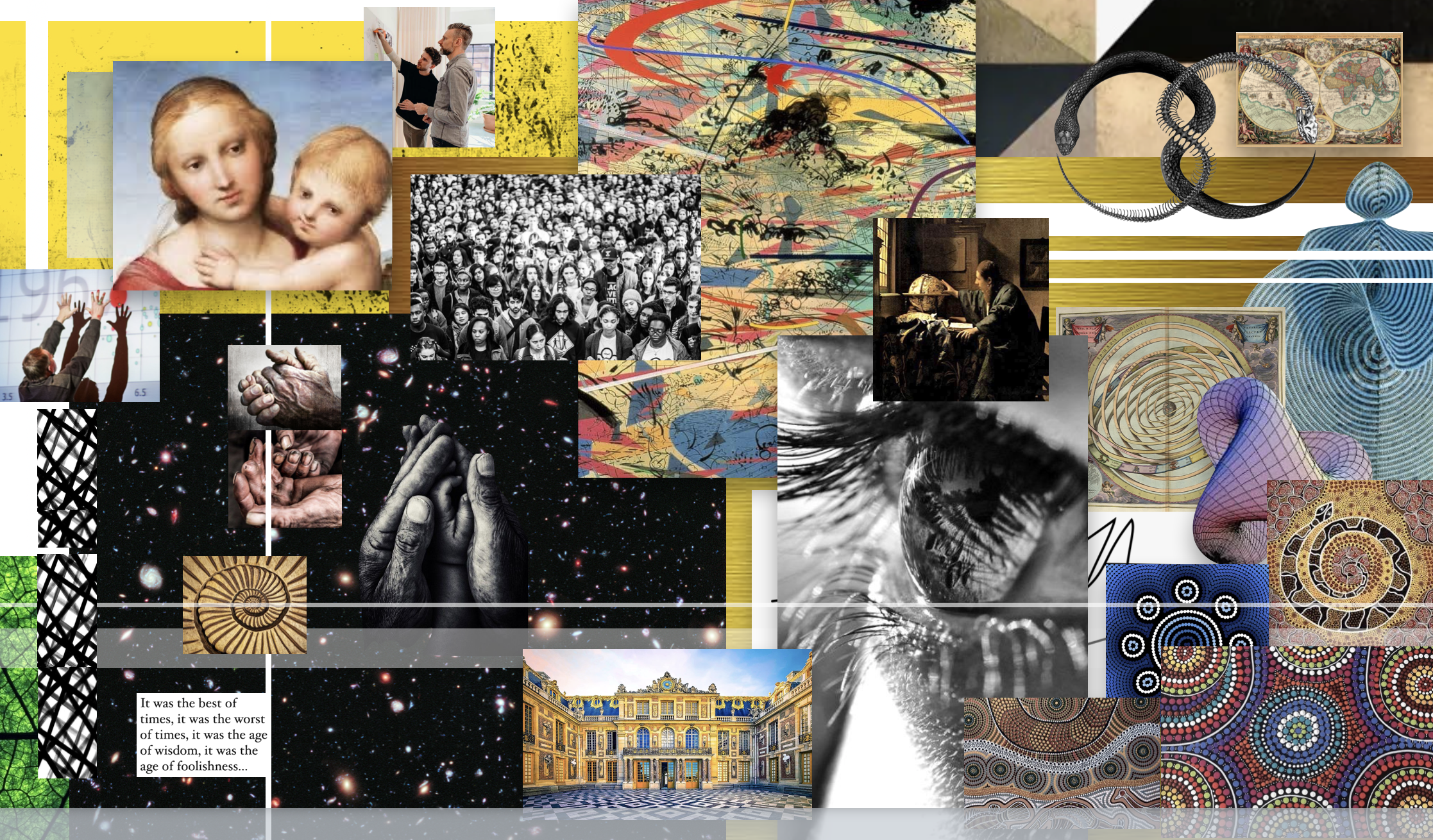
A mood board helps identify a visual direction and discover potential brand elements. Codex delivers aha moments to users by connecting the new and old in surprising ways – what's old is new again. I leaned into this, mixing classical and contemporary to find a distinctive vibe.
Color
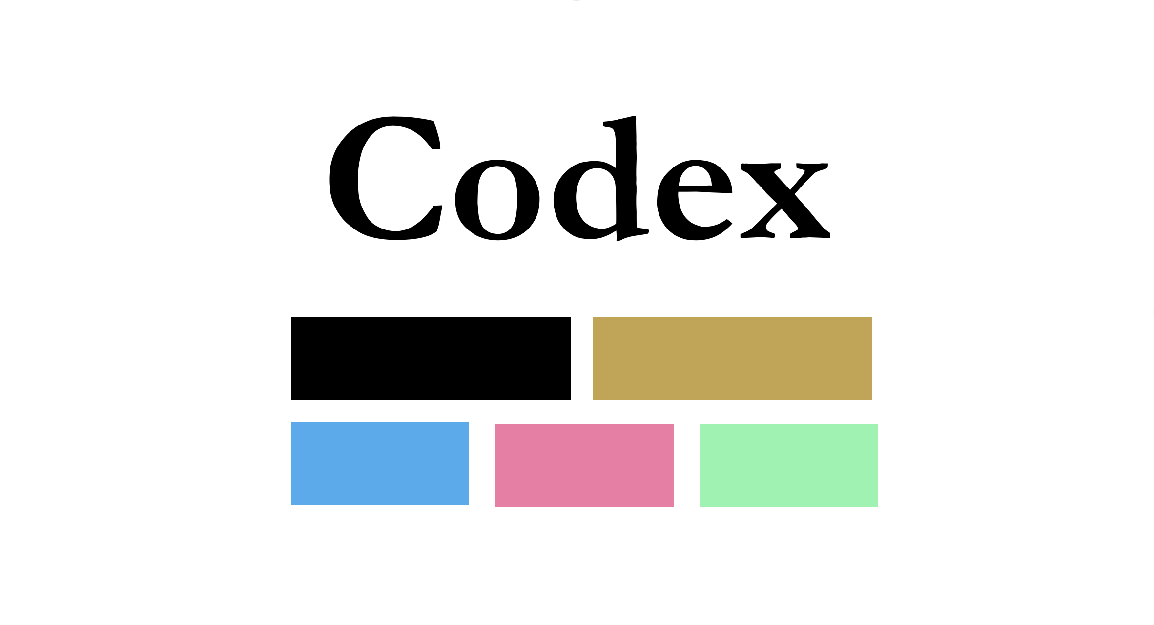
A variety of potential color palettes were sampled from the mood board. Gold was selected as a primary brand color to serve a dual purpose. Gold is both old and timeless and, as a neutral color, it left room for the many other secondary and tertiary colors Codex needed to render its user-interface.
Typography
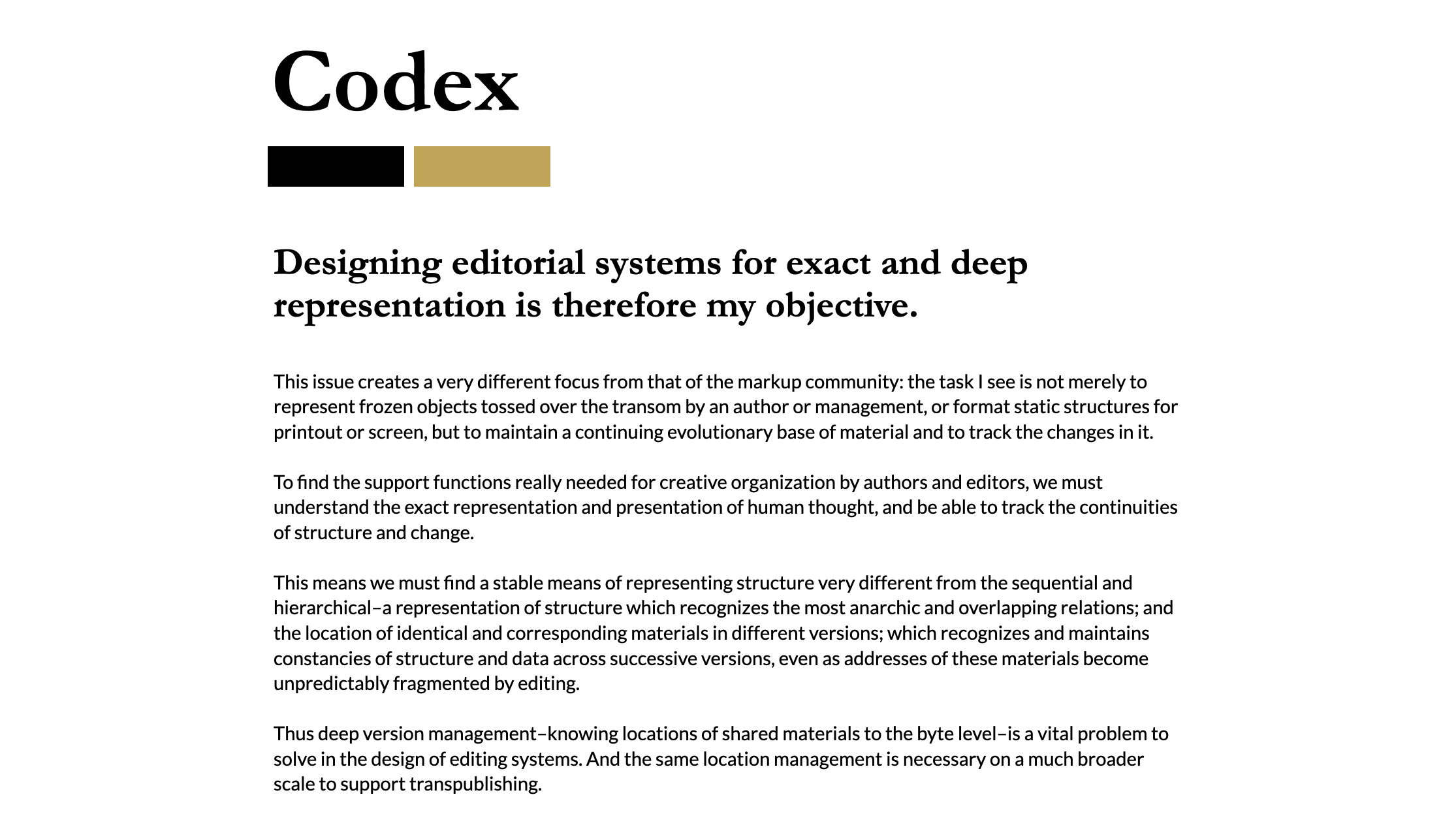
Again, we mix a sense of old and new. A serif for titles provides a classic and self-assured feel of physical print, while a complimentary sans-serif for body text keeps it clean and contemporary.
Marketing, pulling it all together
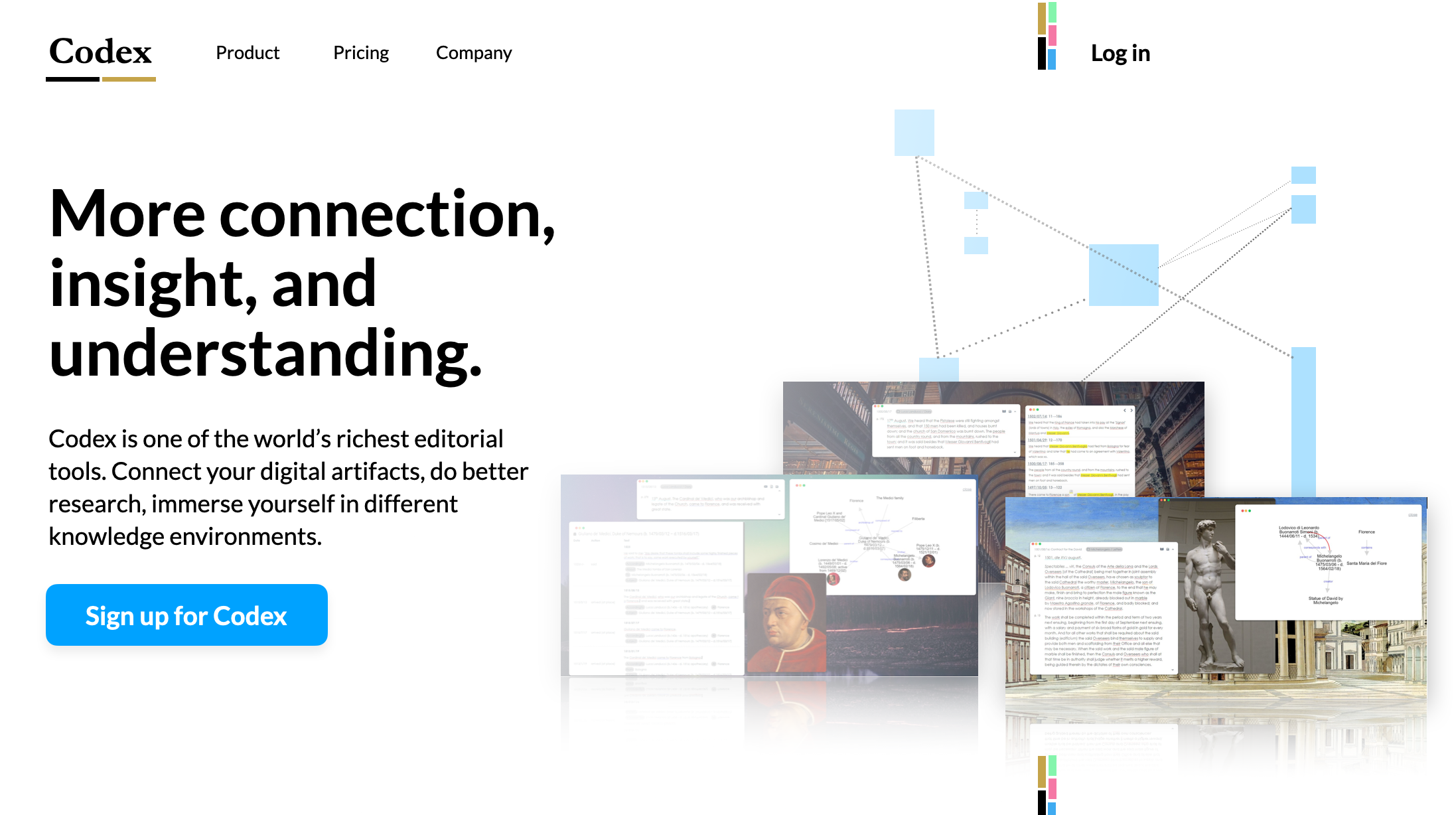
A visual identity makes it easy to build a consistent brand impressions. Here is Codex's new visual identity applied to a product landing page for example.
